What is it?
BEM (Block, Element, Modifier) is a popular naming convention in front-end development that helps to create modular and reusable code. Here’s a cheat sheet for BEM:
Block
- A standalone component that is self-contained and can be reused.
- Use a single word or a hyphen-separated name for the block.
- Example:
.button,.card,.navbar
Element
- A part of a block that cannot be used outside of its parent block.
- Use double underscores (
__) to separate the block and element names. - Example:
.button__text,.card__title,.navbar__item
Modifier
- A variation or state of a block or element.
- Use double hyphens (
--) to separate the block or element name and the modifier. - Example:
.button--primary,.card--large,.navbar__item--active
Selector Structure
- Use a single class for each block or element.
- Combine block, element, and modifier classes to create specific selectors.
- Example:
.button,.button__text,.button--primary
HTML Structure
- Use nested elements to represent the block and its elements.
- Add classes to the appropriate elements to apply BEM naming.
- Example:
<div class="card">
  <h2 class="card__title">Title</h2>
  <p class="card__text">Lorem ipsum dolor sit amet.</p>
</div>
CSS Styles
- Target blocks and elements using their respective classes.
- Use modifier classes to apply specific styles for variations or states.
.button {
  /* Default button styles */
}

.button--primary {
  /* Styles for primary button */
}

.card__title {
  /* Styles for card title */
}
Remember, BEM is just a naming convention, and it’s important to follow good coding practices and maintain consistency throughout your codebase.
Nesting blocks within blocks
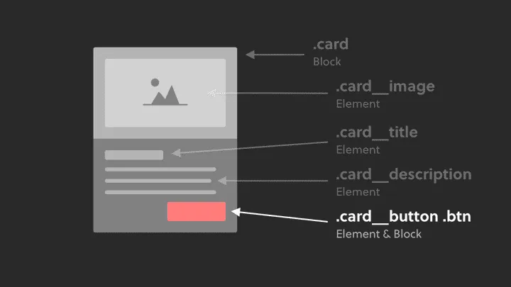
Look at card__button btn
This is acceptable.
Explain: btn might be a block but btn is a reusable components that are repeated everwhere in your project.
now car__button might seems redundant, but it will allow you to do uncommon stuff with it (like aligning it the right)
<div class="card">
    <img class="card__image">
    <h2 class="card__title">I am a card</h2>
    <p class="card__description">I am the card paragraph</p>
    <!-- The element AND block class is applied to the button -->
    <a class="card__button btn">Learn more</a>
</div>
Using BEM modifiers to tweak component styles
Look at btn btn--green
<div class="card">
    <img class="card__image">
    <h2 class="card__title">I am a card</h2>
    <p class="card__description">I am the card paragraph</p>
    <a class="btn btn--green">Learn more</a>
</div>
This btn--green doesn’t do much, it just modifies the original btn to green.
.btn—-green {
    background: green;
}
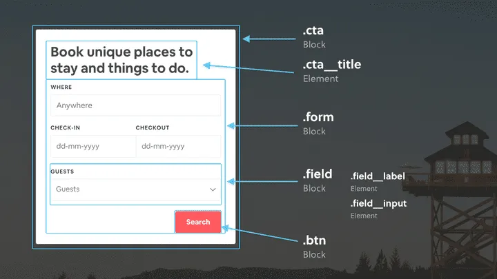
Real example from airbnb
Naming wrappers and containers
<div class="..."> <!-- Wrapper class goes here -->
    <div class="card">
        <img class="card__img" src="..." alt="...">
        <h4 class="card__subtitle">...</h4>
        <p class="card__description">...</p>
        <div class="card__rating">...</div>
    </div>
    <div class="card">...</div>
    <div class="card">...</div>
    <div class="card">...</div>
    <div class="card">...</div>
</div>
<style>
    .card {}
    .card__img {}
    .card__subtitle {}
    .card__description {}
    .card__rating {}
</style>
If there are repeated patterns of how the wrappers work, the best approach would be to use a generic wrapper name like .grid or .wrapper
Here’s another way:
<div class="features-wrapper">
    <div class="feature">...</div>
    <div class="feature">...</div>
    <div class="feature">...</div>
    <div class="feature">...</div>
</div>
<style>
.features-wrapper {
    display: grid;
    grid-column-gap: 1rem;
}
.feature {}
</style>


