What is type scale?
A type scale is a collection of font sizes that are in visual harmony. A typographer chooses sizes from a typographic scale in the same way that a musician chooses notes from a musical scale.
How to generate a type scale?
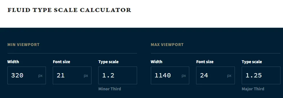
If you’re like me and can’t be bothered to do all the math stuff, you should use a website that calculate and generate a type scale for you. Utopia is my favorite.
Input
Now Utopia requires an input. You need to pick 2 font size, one for the smallest screen size and one for the biggest screen size you have. The page already has 320px width for the min viewport and 1140px width for the max viewport, you can keep that number if you want.
Output
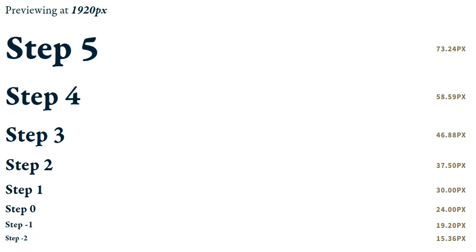
Utopia will generate a type scale for you using steps. You’re gonna use these steps instead of fixed numbers in your designs. This is the ultimate way to make responsive typography and avoid the tedious process of defining a specific numbers for each breakpoint.
Which type scale should I choose?
This can get complicated so I suggest you experiment a little bit. I normally categorize designs into these three:
- High Contrast (banners, marketing sites): These scales have the greatest variation between sizes, and are perfect for large screens
-> Golden Ratio (1.618), Perfect Fifth (1.5), Augmented Fourth (1.414)
- Medium Contrast (blogs): This is the most popular type scale, it has moderate variance between sizes
-> Perfect Fourth (1.333), Major Third (1.25), Minor Third (1.2)
- Low Contrast (websites with a lot of text like E-commerce, news): work well for layouts that contain a lot of identifiers
-> Major Second (1.125), Minor Second (1.067)
Fluid type generator
iOS common font sizes
For example, as of iOS 17 the type sizes would be as follows:
- Titles & Actions = 17px
- Subtitles & Body Copy = 15px
- Secondary Actions = 13px
- Metadata = 11px
Reference
https://tobiasahlin.com/blog/responsive-fluid-css-type-scales/


